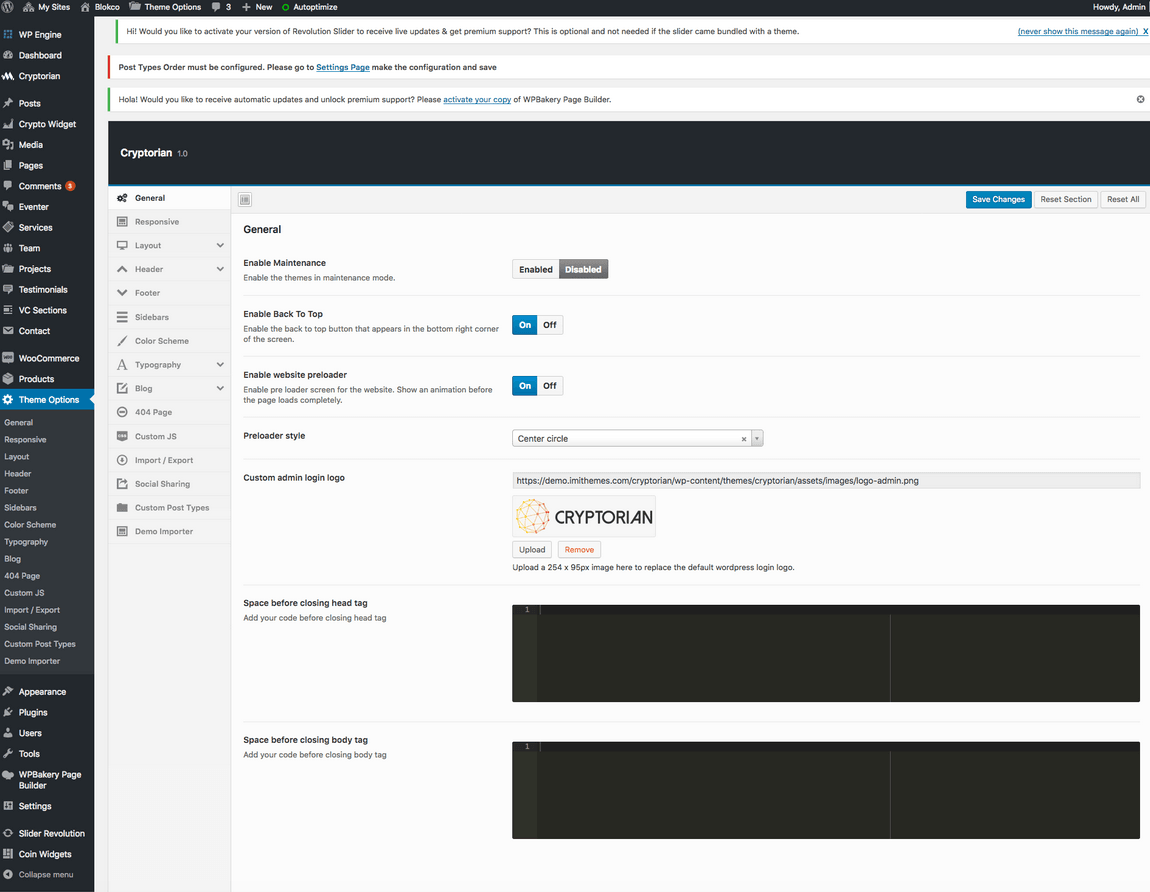
Blokco theme comes with an extensive Theme Options Panel. From the Theme options panel you will be able to set or change the color of the theme, layout, header style, social icons and a lot more. You should take the time to go through all of these options to ensure that you are getting the most out of the theme.
General
Setting
Description
Enable Maintenance
Put the site into maintenance mode. Visitors see a maintenance notice. Default: Disabled.
Enable Back To Top
Show or hide the “Back to Top” button in the bottom-right corner. Default: Enabled.
Enable Preloader
Show a loading/preloader animation screen while the site loads. Default: Disabled.
Preloader Style
Style of the preloader animation. Options: Barber Shop, Big Counter, Center Circle, Corner Indicator, Fill Left, Flash, Flat Top, Loading Bar, Mac OSX, Minimal. Default: Center Circle.
Custom admin login logo
Upload a 254×95px image to replace the WordPress login logo.
Space before closing head tag
Paste custom code to output before the </head> tag.
Space before closing body tag
Paste custom code to output before the </body> tag.
Wide (full-width) or Boxed (centred with background). Default: Wide.
Site Width
Site container width in pixels (no “px”). Default: 1170.
Repeatable Background Images
Choose from built-in tile patterns for the Boxed layout body background.
Upload Repeatable Background Image
Upload a custom tile image for Boxed layout.
Upload Full Screen Background Image
Upload a full-screen image for Boxed layout body area.
Layout – Content
Setting
Description
Content area Background
Background color or image for the main content area.
Top and Bottom padding
Padding for the content wrapper. Default: 60px top/bottom.
Minimum Height
Minimum content area height in pixels (no “px”). Default: 400.
100% Content Width
Set content area to 100% browser width. Wide layout only.
Header
Setting
Description
Header Layout
Choose from 11 header layout styles. Each arranges logo, nav, search, cart, and info blocks differently. Default: Style 1.
Header Left/Right Blocks
Drag-and-drop sorter to configure which elements appear on the left and right of the header (logo, menu, search, cart, featured buttons, info blocks, social icons, widgets opener).
100% Header Width
Set the header to span 100% browser width. Wide layout only.
Header Position
Fixed at top (Normal) or floating over page content (Floated).
Header Background Color
Set the header background with optional transparency (RGBA).
Header Background Image
Upload a background image for the header.
No Box Shadow
Remove the header drop shadow. Default: Enabled (Blokco) / Disabled (Capital).
Main Navigation Links Typography
Font, size, weight, and line-height for nav links.
Main Navigation Link Color
Text color, hover, and active states for main nav links.
Direction arrows with menu label
Show dropdown indicator arrows next to menu items. Default: Enabled.
Background color for dropdown menus
Background for dropdown panels. Default: #ffffff.
Dropdown links border/spacing
Border style and padding for each dropdown link item.
Dropdown links hover background
Background fill when hovering a dropdown link.
Dropdown Menu Links Typography
Font settings for dropdown link text.
Dropdown links color
Color states for dropdown links.
Header Info Typography/Colors
Font size, color, and spacing for the header info block content (used in styles with info blocks).
Social Icons Style/Size/Color
Shape, size, style, and color settings for social icons shown in the header.
Search Module Style
Style and dimensions of the search trigger icon, dropdown search form, or open/overlay search form.
Cart Module Style
Style and dimensions of the WooCommerce cart trigger icon and dropdown cart panel.
Header – Featured Buttons
Setting
Description
Button 1/2/3 Label
Display text for each of up to three featured action buttons in the header.
Button 1/2/3 URL
Link URL for each featured button.
Button Shape
Button corner style: Rounded, Square, or Round (pill). Default: Rounded.
Button Size
Button size: XS, S, M, L, or Custom. Default: M.
Button Background Color
Background fill and optional transparency for each button (normal and hover states).
Button Border
Border style, width, and color for each button (normal and hover states).
Button Link Color
Text color states (normal/hover/active) for each button.
Button Typography
Font, size, and weight for each button label.
Header – Info Blocks
Setting
Description
Header Info 1/2/3
HTML text content for each of three info blocks in the header (e.g., address, phone, hours). Supports inline HTML.
Header – Social Links
Setting
Description
Social Links
Enter social profile URLs for the header. Supports 22 networks including Facebook, Twitter, Instagram, LinkedIn, YouTube, GitHub, and more.
Shape
Icon shape: Round, Rounded, Square, or Plain. Default: Round.
Size
Icon size: Small, Medium, Large, XLarge, or Custom. Default: Medium.
Style
Color scheme: Brand Colors, Primary, Secondary, or Greyscale. Default: Brand Colors.
Hover Style
Color scheme applied on hover.
Social Links Color
Custom color override for social icons.
Header – Overlay Content
Setting
Description
Enable Overlay Content
Show a slide-out panel triggered by a button in the header. Default: Enabled.
Opener button text
Icon/text for the overlay content trigger button. Default: grid icon.
Overlay content block position
Where the panel slides in from: Left, Top, or Right. Default: Right.
Keep opened by default
Start with the overlay panel open when the page loads. Default: Disabled.
Width of overlay content block
Width of the slide-out panel. Default: 350px.
Side padding
Internal padding of the overlay panel.
Background color
Background fill for the overlay content area. Default: #303030.
Overlay Content VC Section
Select a WPBakery Page Builder section to display inside the overlay panel.
Header – Search Form Style
Setting
Description
Search form style
Choose how the search form opens: Dropdown, Open (always visible), or Overlay (full-screen). Default: Dropdown.
Search form background/border
Background color and border settings for the search form.
Search form text color
Text color for the search input field.
Search icon color
Color states for the search trigger icon.
Close button style
Dimensions, background, and color settings for the overlay search close button.
Header – Topbar
Setting
Description
(Topbar fields)
The Topbar section provides settings for a thin strip above the main header — typically used for announcements, contact info, or additional navigation links. See the Topbar section in Theme Options for full details.
Header – Sticky Header
Setting
Description
(Sticky Header fields)
Settings to configure the header behaviour when it sticks to the top of the viewport on scroll — including background, logo, and visibility controls. See the Sticky Header section in Theme Options for full details.
Header – Mobile Header
Setting
Description
(Mobile Header fields)
Settings for the hamburger menu opener, mobile nav background, link colors, and sub-menu opener dimensions for small-screen devices. See the Mobile Header section in Theme Options.
Inner Page Header
Setting
Description
Default banner image
Default header/banner image for all inner pages, posts, and custom post types without their own featured image.
Banner height
Height of the inner page banner area in pixels.
Show page title
Show or hide the page/post title inside the banner.
Title typography
Font, size, weight, and color for the banner title text.
Logo
Setting
Description
Upload Logo
Upload the main site logo.
Upload Logo for Retina Devices
Upload a 2× resolution logo for high-DPI screens.
Standard Logo Width / Height for Retina
Enter the 1× logo dimensions (do not enter retina dimensions).
Footer
Setting
Description
100% Footer Width
Set footer to 100% browser width. Wide layout only.
Footer Background
Background color or image for the entire footer area.
Footer Top/Bottom padding
Padding for the footer. Configurable for widget area and copyright bar separately.
Footer border top
Top border line for the footer.
Footer Layout
Number of widget columns: 1–5. Default: 4.
Footer widget title typography
Font, size, and weight for footer widget titles.
Footer widget text typography
Font settings for footer widget body text.
Footer widget links color
Link color states for footer widgets.
Enable footer copyright area
Show or hide the copyright bar. Default: Enabled.
Footer Copyright Text
Text in the copyright bar. Default: “All Rights Reserved”.
Footer social links
Social icons in the footer. Drag to reorder.
Sidebars
Setting
Description
Sidebar position
Global position: Left, Right, or None. Overridable per page/post.
Post / Page / Archive sidebars
Select default sidebars for single posts, pages, post archives, and search pages.
Custom post type sidebars
Select default sidebars for each custom post type (Services, Projects, Team, etc.) and their archive pages.
Shop Archive Sidebar
Sidebar for the WooCommerce shop archive.
Color Scheme
Setting
Description
Color Scheme
Pre-Defined (12 presets) or Custom Color. Default: Pre-Defined.
Predefined Color Schemes
Choose from color1.css – color12.css. Default: color1.css.
Custom Theme Color
Pick a custom primary accent color.
Typography
Setting
Description
Heading font
Google Font for all headings.
Body/Primary font
Google Font for body text.
H1–H6 individual overrides
Fine-tune font, size, weight, line-height, and color per heading level.
Body text override
Override body font settings independently.
Additional Font 1–6
Load up to 6 extra Google Font families for use in custom CSS.
Blog
Setting
Description
Blog settings
Configure the blog listing layout, post meta display (date, author, category), excerpt length, read more text, and post thumbnail style.
Single Post
Setting
Description
Single post settings
Configure what metadata (date, author, tags, share buttons) is shown on individual blog post pages.
404 Page
Setting
Description
Page header image
Banner image for the 404 error page header.
Page header height
Height of the 404 banner. Default: 200px.
Page title
Custom title for the 404 page.
Page content
HTML/text content shown in the 404 page body.
Social Sharing
Setting
Description
Social Sharing
Master switch for sharing buttons. Default: Enabled.
Share Buttons Style
Rounded or Squared icons.
Share Buttons Color
Brand Colors, Theme Color, or Greyscale.
Social share networks
Toggle individual networks on/off.
Share buttons for post types
Control which post types show share buttons.
Tooltip text per network
Custom hover tooltip for each share icon.
Share icons size
Box dimensions and font size for share buttons.
Custom Post Types
Configure URL slugs, WordPress Dashboard menu labels, and archive page settings for each custom post type. After changing slugs, go to Settings → Permalinks and click Save.
Custom CSS/JS
Setting
Description
CSS Code
Custom CSS injected site-wide via the Ace editor (Monokai theme).
JS Code
Custom JavaScript injected at the bottom of every page via the Ace editor.
ℹ️ Custom CSS/JS is stored in the database and survives theme updates. For larger projects, consider using a child theme.
Import/Export
Setting
Description
Export
Copy all Theme Options as a portable data string for backup or migration to another installation.
Import
Paste exported data to restore all Theme Options. Overwrites current configuration.
Reset to Defaults
Resets all Theme Options to factory defaults. Always export a backup first.
How can we help?
Subscribe to website maintenance plans exclusively offered to our themes & plugins users and enjoy flat 50% off for lifetime.Subscribe Now & Save 50%