Fill in your content for the items you can use for your header, topbar, sticky header or mobile header
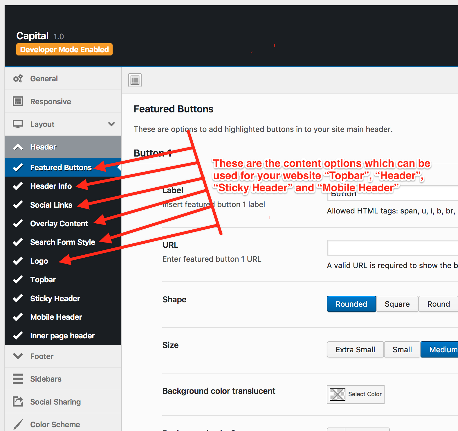
| Setting | Description |
|---|---|
| Button Label | Display text for each featured button. Up to 3 buttons can be configured. |
| Button URL | The link destination for each button. |
| Button Shape | Corner style: Rounded, Square, or Round (pill). Default: Rounded. |
| Button Size | Preset sizes (XS/S/M/L) or Custom. Default: M. |
| Background Color | Fill color for normal and hover states, with optional opacity. |
| Border | Border style, width, and color for normal and hover states. |
| Link Color | Text color for normal, hover, and active button states. |
| Typography | Font family, size, and weight for the button label. |