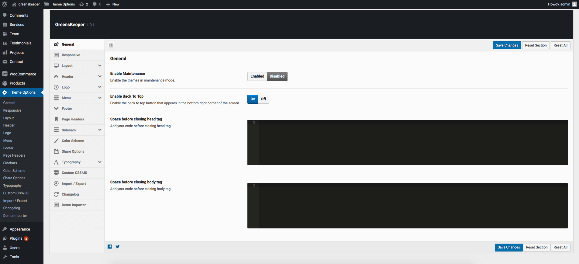
Greenskeeper theme comes with an extensive Theme Options Panel. From the Theme options panel you will be able to set or change the color of the theme, layout, header style, social icons and a lot more. You should take the time to go through all of these options to ensure that you are getting the most out of the theme.
General
Setting
Description
Enable Maintenance
Put the site into maintenance mode. Visitors see a maintenance notice. Default: Disabled.
Enable Back To Top
Show or hide the floating “Back to Top” button in the bottom-right corner. Default: Enabled.
Space before closing head tag
Paste custom code (meta tags, tracking scripts) to be output before the closing </head> tag.
Space before closing body tag
Paste custom code (analytics snippets, scripts) to be output before the closing </body> tag.
Responsive
Setting
Description
Enable Responsive
Toggle the responsive (mobile-friendly) layout on or off. Default: Enabled.
Enable Zoom on mobile devices
Allow pinch-to-zoom on touch/mobile devices. Default: Disabled.
Layout
Setting
Description
Page Layout
Choose between Wide (full-width) or Boxed (centred container with visible body background). Default: Wide.
Repeatable Background Images
When Boxed layout is selected: choose from 30 built-in tile patterns for the body background.
Upload Repeatable Background Image
Upload your own repeatable tile image for the Boxed layout body background.
Upload Full Screen Background Image
Upload a full-screen non-tiling background image for the Boxed layout body area.
Site Width
Overall site container width in pixels. Do not include “px”. Default: 1170.
Layout – Content
Setting
Description
Content area Background
Background color or image for the main content area. Works for both Wide and Boxed layouts.
Top and Bottom padding for content area
Top and bottom padding for the content wrapper. Default: 60px / 60px.
Minimum Height for Content area
Minimum height for the content area (no “px”). Default: 400.
100% Content Width
Set the content area to 100% of browser width. Only available in Wide layout mode.
Header
Setting
Description
Header Layout
Select from three header style layouts (Style 1, 2, or 3). Each arranges the logo, info blocks, navigation, and social icons differently. Default: Style 1.
100% Header Width
Set the header to span 100% browser width. Only available in Wide layout mode.
Height of header
Height of the header area where the logo and info blocks appear (in px). Default: 70px.
Width of logo area
Width of the logo container (in px). Default: 300px.
Logo Spacing
Top/Right/Bottom/Left padding around the logo. Default: 12px top, 50px right, 12px bottom, 0px left.
Logo Background
Background color for the logo area block.
Header Background (styles 1 & 2)
Background color or image for the header area in Layout Styles 1 and 2.
Header Background (style 3)
Background color (with opacity) for the header area in Layout Style 3.
Site tagline typography
Font, size, weight, and color for the site tagline shown in the header.
Header – Info Blocks
Setting
Description
Show/Hide
Toggle the header info blocks on or off. Default: Enabled.
Header Info Block 1 / 2 / 3 Icon
FontAwesome icon class for each info block (e.g. fa fa-map-marker, fa fa-phone, fa fa-clock-o). See fontawesome.io/icons.
Header Info Block 1 / 2 / 3 Text
HTML text content for each info block. Supports <strong>, <br>, and other inline HTML.
Header Info Blocks Spacing (style 1)
Padding around the info blocks in Header Style 1. Default: 15px top, 20px left.
Header Info Blocks Spacing (styles 2 & 3)
Padding around the info blocks in Header Styles 2 and 3. Default: 30px right.
Width/Height of Info Block Icon
Dimensions of each info block icon container (px). Default: 40×40px.
Info Block Icon border
Border style and width for icon containers. Default: 2px solid.
Info Block Icon size and color
Font size and line-height for info block icons. Default: 20px / 36px.
Info Block Text Typography
Font, size, and color for info block text. Default: 13px / 17px line-height, color #999999.
Header – Social Links
Setting
Description
Social Links
Enter social profile URLs and enable/reorder icons for the header. Supported networks: Facebook, Twitter, Pinterest, Google+, YouTube, Instagram, Vimeo, RSS, Dribbble, Dropbox, Bitbucket, Flickr, Foursquare, GitHub, LinkedIn, Skype, Tumblr, VKontakte, Email.
Social icons size (style 1)
Font size and line-height for social icons in Header Style 1. Default: 20px / 60px line-height.
Social icons size (styles 2 & 3)
Font size and line-height for social icons in Header Styles 2 and 3. Default: 20px / 40px line-height.
Link / Hover / Active color
Color states for header social icons. Default: #5e5e5e.
Header social icons spacing
Margin around each social icon. Default: 5px right, 20px left.
Header – Featured Buttons
Setting
Description
Featured Menu Buttons
Enable or disable up to three featured call-to-action buttons in the header. Default: Disabled.
Button 1 / 2 / 3 Label
Display text for each featured button.
Button 1 / 2 / 3 URL
Link URL for each featured button.
Featured buttons typography
Font, size, and weight for featured button labels.
Featured buttons margin (style 1)
Margin around featured buttons in Header Style 1. Default: 11px top, 30px left.
Featured buttons margin (styles 2 & 3)
Margin around featured buttons in Header Styles 2 and 3. Default: 30px left.
Featured buttons padding
Inner padding for each featured button. Default: 5px top/bottom, 12px left/right.
Link / Hover / Active color
Text color states for featured buttons. Default: #ffffff.
Featured buttons background color
Background fill for featured buttons.
Featured buttons hover background color
Background fill for featured buttons on hover.
Header – Topbar
Setting
Description
Show Topbar
Show or hide the thin topbar strip above the main header. Default: Enabled.
Topbar background
Background color or image for the topbar strip.
Topbar padding
Top/Right/Bottom/Left padding for the topbar. Default: 15px top/bottom.
Logo
Setting
Description
Upload Logo
Upload the main site logo displayed in the header.
Upload Logo for Retina Devices
Upload a 2× resolution logo for high-DPI (Retina) screens.
Standard Logo Width for Retina Logo
Enter the standard (1×) logo width in pixels. Do not enter the retina image width. Default: 230.
Standard Logo Height for Retina Logo
Enter the standard (1×) logo height in pixels. Default: 46.
Logo – Admin Logo
Setting
Description
Custom admin login logo
Upload a 254×95px image to replace the default WordPress logo on the wp-login.php page.
Menu
Setting
Description
Enable search with menu
Show or hide the search icon next to the main navigation. Default: Enabled.
Enable cart with menu
Show or hide the WooCommerce cart icon next to the main navigation. Default: Enabled.
Main Navigation Background
Background color or image for the menu bar (Header Style 1).
Direction arrows with menu label
Show or hide the dropdown indicator arrows next to menu items that have sub-menus. Default: Enabled.
Space between nav items (style 1)
Right/Left margin between navigation links in Header Style 1. Default: 35px right.
Space between nav items (styles 2 & 3)
Right/Left margin between navigation links in Header Styles 2 and 3. Default: 35px left.
Main Navigation Links Typography (style 1)
Font, size, weight, and line-height for nav links in Style 1. Default: 16px / 60px line-height.
Main Navigation Links Typography (styles 2 & 3)
Font, size, weight, and line-height for nav links in Styles 2 and 3. Default: 16px / 70px.
Main Navigation Link Color
Text color, hover color, and active color for main navigation links.
Background color for dropdown menus
Background for the dropdown sub-menu panel.
Dropdowns top border
Top border style for dropdown panels.
Dropdowns Drop Shadow
Show or hide the CSS drop shadow on dropdown panels. Default: Enabled.
Dropdowns Border Radius
Border radius value for dropdown panels (no “px”). Example: 4.
Dropdown links border bottom
Bottom border for each dropdown link item.
Dropdown links spacing
Padding for each dropdown link. Default: 12px top/bottom, 20px left/right.
Background color for dropdown links hover
Background fill when hovering a dropdown link.
Dropdown Menu Links Typography
Font, size, and weight for dropdown link text.
Dropdown links color
Text color states for dropdown links.
Megamenu Background color
Background fill for megamenu panels.
Megamenu Column Title Typography
Font settings for megamenu column headings.
Megamenu Content Typography
Font settings for megamenu body content.
Menu – Mobile Menu
Setting
Description
Enable Side menu
Enable off-canvas side menu for small screens. When disabled, a standard toggle dropdown is used. Note: MegaMenu does not work in side menu mode. Default: Disabled.
Side menu style
Visual style for the side menu: Dark or Light. Default: Dark.
Side menu position
Side from which the off-canvas menu slides in: Left or Right. Default: Left.
Width/Height of sub menu opener
Dimensions of the button that expands first-level sub-menus in mobile nav. Default: 75×61px.
Background color for sub menu opener
Background for the first-level sub-menu opener button.
Sub menu opener icon size
Font size of the expand icon. Default: 16px.
Sub menu opener icon color
Normal and hover colors for the sub-menu opener icon.
Width/Height of sub-sub menu opener
Dimensions for the second-level sub-menu opener. Default: 75×41px.
Background color for sub-sub menu opener
Background for the second-level sub-menu opener button.
Sub-sub menu opener icon size
Font size of the second-level expand icon. Default: 16px.
Sub-sub menu opener icon color
Normal and hover colors for the second-level sub-menu opener icon.
Footer
Setting
Description
100% Footer Width
Set footer to 100% browser width. Only available in Wide layout mode.
Footer Widgets Layout
Number of widget columns in the footer: 1, 2, 3, 4 (default), or 5.
Footer widget area background
Background color for the footer widget area. Default: #404040.
Footer widgets area Top/Bottom padding
Top and bottom padding for the footer widget area. Default: 70px top/bottom.
Footer widgets title typography
Font, size, weight, and color for footer widget titles.
Footer widgets area text typography
Font settings for footer widget body text.
Footer widgets area links color
Link color states for footer widget links.
Enable Footer copyrights area
Show or hide the copyright bar below the footer widgets. Default: Enabled.
Footer Copyright Text
Text displayed in the copyright bar. Default: “All Rights Reserved”.
Footer copyrights area background
Background color for the copyright bar.
Footer copyrights area Top/Bottom padding
Padding for the copyright bar. Default: 20px top/bottom.
Footer copyrights area text typography
Font settings for copyright bar text.
Footer copyrights area links color
Link color states inside the copyright bar.
Social Links
Social profile URLs shown as icons in the footer. Drag to reorder.
Social icons size and color
Font size and line-height for footer social icons. Default: 15px / 30px.
Social icons Link / Hover / Active color
Color states for footer social icons. Default: #ffffff.
Social icons background color
Background fill for footer social icon buttons. Default: #222222.
Social icons Width/Height
Dimensions of footer social icon buttons. Default: 30×30px.
Page Headers
Setting
Description
Upload page header image
Default banner image for all inner pages/posts without a featured image.
Upload page header for Projects Category
Default banner for Projects category/archive pages.
Upload page header for Services Category
Default banner for Services category/archive pages.
Upload page header for Team Category
Default banner for Team category/archive pages.
Upload page header for Search results
Default banner for the search results page.
Sidebars
Setting
Description
Sidebar position
Global sidebar position: Left, Right, or None. Overridable per page/post. Default: Right.
Default single post Sidebar
Sidebar for individual blog post pages. Default: post-sidebar.
Default Page Sidebar
Sidebar for standard pages.
Post Archive Sidebar
Sidebar for blog archive/category pages.
Search Page Sidebar
Sidebar for the search results page. Default: post-sidebar.
Default Services post Sidebar
Sidebar for single Services post pages.
Services Archive Sidebar
Sidebar for Services archive/category pages.
Default Projects post Sidebar
Sidebar for single Projects post pages.
Projects Archive Sidebar
Sidebar for Projects archive/category pages.
Default Team post Sidebar
Sidebar for single Team member pages. Default: page-sidebar.
Team Archive Sidebar
Sidebar for Team archive/category pages.
Shop Archive Sidebar
Sidebar for WooCommerce shop archive. Default: page-sidebar.
Sidebar Widgets Styling
Setting
Description
Typography for sidebar widgets
Font, size, and color for sidebar widget body text.
Link colors for sidebar widgets
Color states for links inside sidebar widgets.
Sidebar widgets title typography
Font, size, weight, and color for sidebar widget titles.
Color Scheme
Setting
Description
Color Scheme
Choose between Pre-Defined Color Schemes (12 presets) or Custom Color. Default: Pre-Defined.
Predefined Color Schemes
When Pre-Defined is selected: choose from color1.css through color12.css. Each applies a coordinated palette to buttons, links, and accents. Default: color1.css.
Custom Theme Color
When Custom Color is selected: pick a primary accent colour using the colour picker.
Custom Post Types
Configure the permalink slugs, dashboard menu labels, and archive page settings for each of Greenskeeper’s custom post types. Changes to slugs require a Settings → Permalinks save to take effect.
Setting
Description
Projects slug / menu name / archive title
Customise the URL slug (e.g. “portfolio”), WP Dashboard sidebar label, and archive page title for the Projects post type.
Disable Project archive page
Prevent WordPress from auto-creating a projects archive page (useful when the slug conflicts with an existing page). Default: Disabled.
Services slug / menu name / archive title
Same customisation options for the Services post type.
Disable Service archive page
Disable the auto-generated Services archive page. Default: Disabled.
Team slug / menu name / archive title
Same customisation options for the Team post type.
Disable Team archive page
Disable the auto-generated Team archive page. Default: Disabled.
Testimonials slug / menu name / archive title
Same customisation options for the Testimonials post type.
Disable Testimonial archive page
Disable the auto-generated Testimonials archive page. Default: Disabled.
Share Options
Setting
Description
Social Sharing
Master switch to enable or disable all social sharing buttons site-wide. Default: Enabled.
Share Buttons Style
Icon shape: Rounded or Squared.
Share Buttons Color
Colour scheme: Brand Colors, Theme Color, or Greyscale.