Vestige Museum theme comes with an extensive Theme Options Panel. From the Theme options panel you will be able to set or change the color of the theme, layout, header style, social icons and a lot more. You should take the time to go through all of these options to ensure that you are getting the most out of the theme.
General
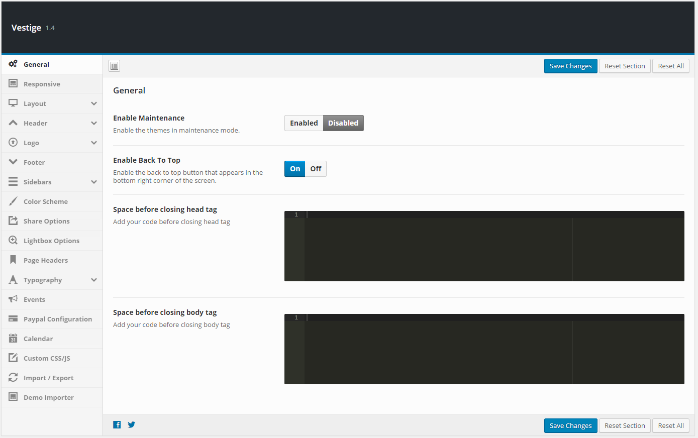
| Setting | Description |
|---|---|
| Enable Maintenance | Put the site into maintenance mode. Visitors see a maintenance notice instead of the front end. Default: Disabled. |
| Enable Back To Top | Show or hide the floating “Back to Top” button in the bottom-right corner. Default: Enabled. |
| Space before closing head tag | Paste custom code (meta tags, scripts) to be output before the closing </head> tag. |
| Space before closing body tag | Paste custom code (analytics, scripts) to be output before the closing </body> tag. |
Responsive
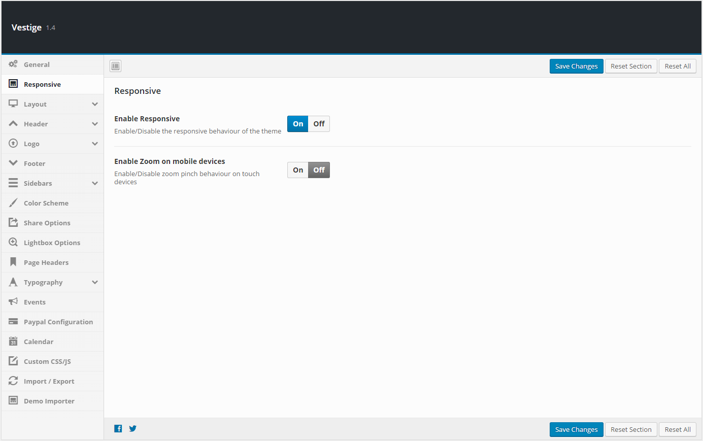
| Setting | Description |
|---|---|
| Enable Responsive | Toggle the responsive (mobile-friendly) layout on or off. Default: Enabled. |
| Enable Zoom on mobile devices | Allow pinch-to-zoom behaviour on touch devices. Default: Enabled. |
Layout
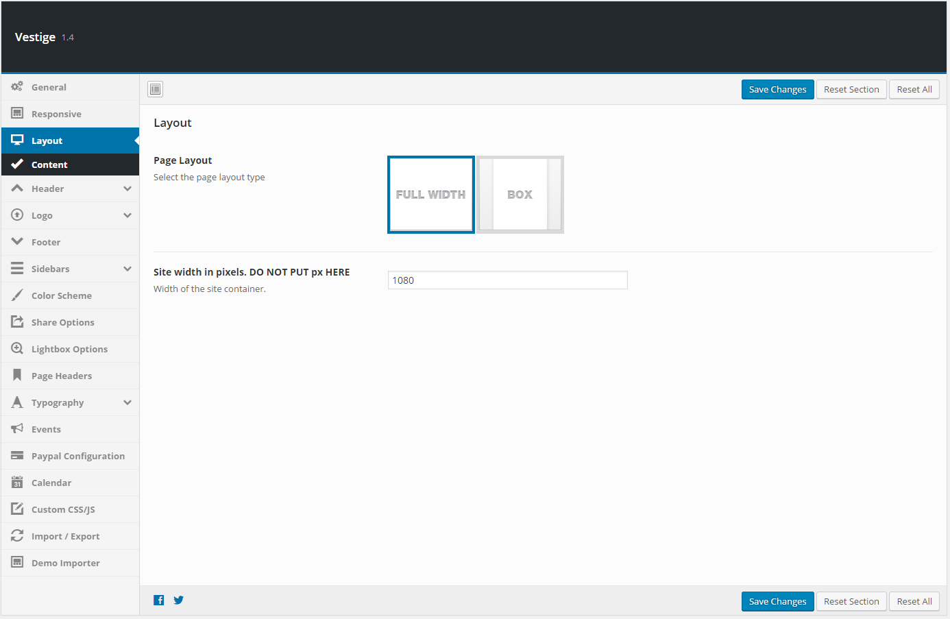
| Setting | Description |
|---|---|
| Page Layout | Choose between Wide (full-width container) or Boxed (centred container with a visible body background). Default: Wide. |
| Repeatable Background Images | When Boxed layout is selected: choose from built-in repeatable tile patterns for the body background. |
| Upload Repeatable Background Image | Upload your own custom repeatable tile image for the Boxed layout body background. |
| Upload Full Screen Background Image | Upload a full-screen (non-tiling) background image for the Boxed layout body area. |
| Site Width | Set the overall site container width in pixels. Do not include “px”. Default: 1170. |
Layout – Content
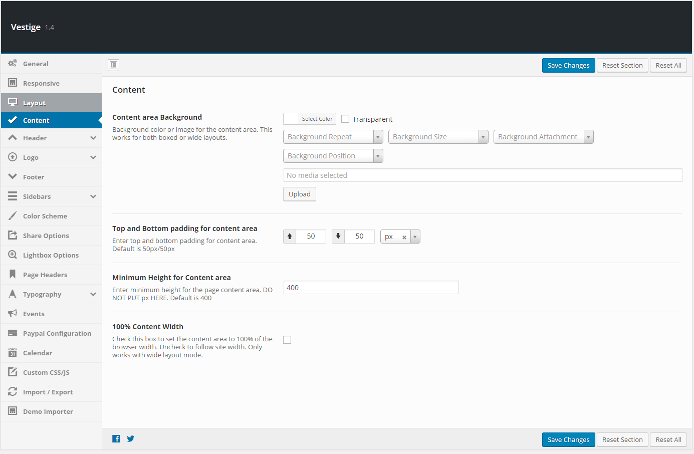
| Setting | Description |
|---|---|
| Content area Background | Background color or image for the main content area. Applies to both Wide and Boxed layouts. |
| Top and Bottom padding for content area | Top and bottom padding for the content wrapper. Default: 50px / 50px. |
| Minimum Height for Content area | Minimum height for the content area in pixels (do not include “px”). Default: 400. |
| 100% Content Width | Check to set the content area to 100% of the browser width. Only available in Wide layout mode. |
Header

| Setting | Description |
|---|---|
| Header Layout | Select from available header style layouts (v1, v2, v3, v4). Each arranges the logo, navigation, and action buttons differently. |
| Header Translucent Background Color | Set a semi-transparent overlay background color for the header area. |
| Header Background Image | Upload a background image for the header. |
| 100% Header Width | Set the header to span 100% of the browser width. Only available in Wide layout mode. |
| Button1 / Button2 / Button3 Label | Text label for each of up to three action buttons shown in Header Style 3. |
| Button1 / Button2 / Button3 URL | Link URL for each action button in Header Style 3. |
| Button1 / Button2 / Button3 Style | Visual style (e.g. filled, outline) for each action button in Header Style 3. |
Header – Sticky Header
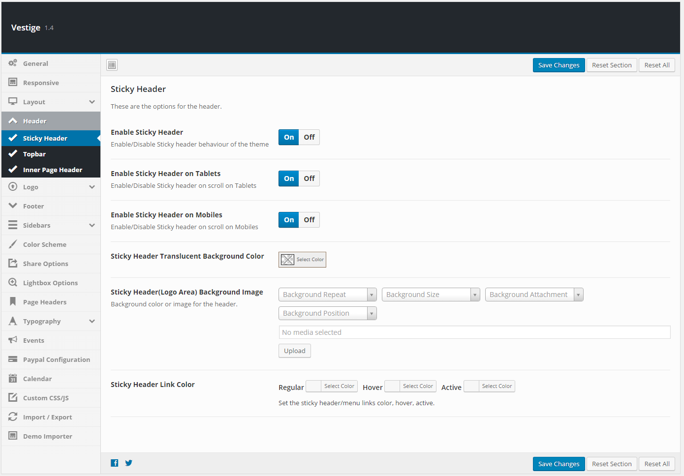
| Setting | Description |
|---|---|
| Enable Sticky Header | Keep the header fixed at the top of the viewport as the user scrolls down. Default: Enabled. |
| Enable Sticky Header on Tablets | Apply sticky behaviour on tablet-sized screens. |
| Enable Sticky Header on Mobiles | Apply sticky behaviour on mobile screens. |
| Sticky Header Translucent Background Color | Background color for the sticky header when it activates. |
| Sticky Header (Logo Area) Background Image | Background image for the logo area within the sticky header. |
| Sticky Header Link Color | Text color, hover color, and active color for sticky header navigation links. |
Header – Topbar

| Setting | Description |
|---|---|
| Enable TopBar | Show or hide the thin top bar displayed above the main header. Default: Disabled. |
| Text for the TopBar left column | Short text (e.g. phone number, address, announcement) displayed on the left side of the top bar. |
| Social Links | Social profile URLs shown as icons in the top bar. Drag to reorder. Supported networks: Facebook, Twitter, Pinterest, and others. |
Header – Inner Page Header

| Setting | Description |
|---|---|
| Header Image | Default banner/header image for all inner pages, posts, and custom post types that do not have their own featured image set. |
| Height of inner pages header | Height of the banner area in pixels (do not include “px”). Default: 260. |
| Show page title in page header | Toggle the display of the page or post title inside the banner area. Overrides individual page settings. |
| Inner page header title typography | Font, size, weight, and color for the title text shown inside the page header banner. |
Logo
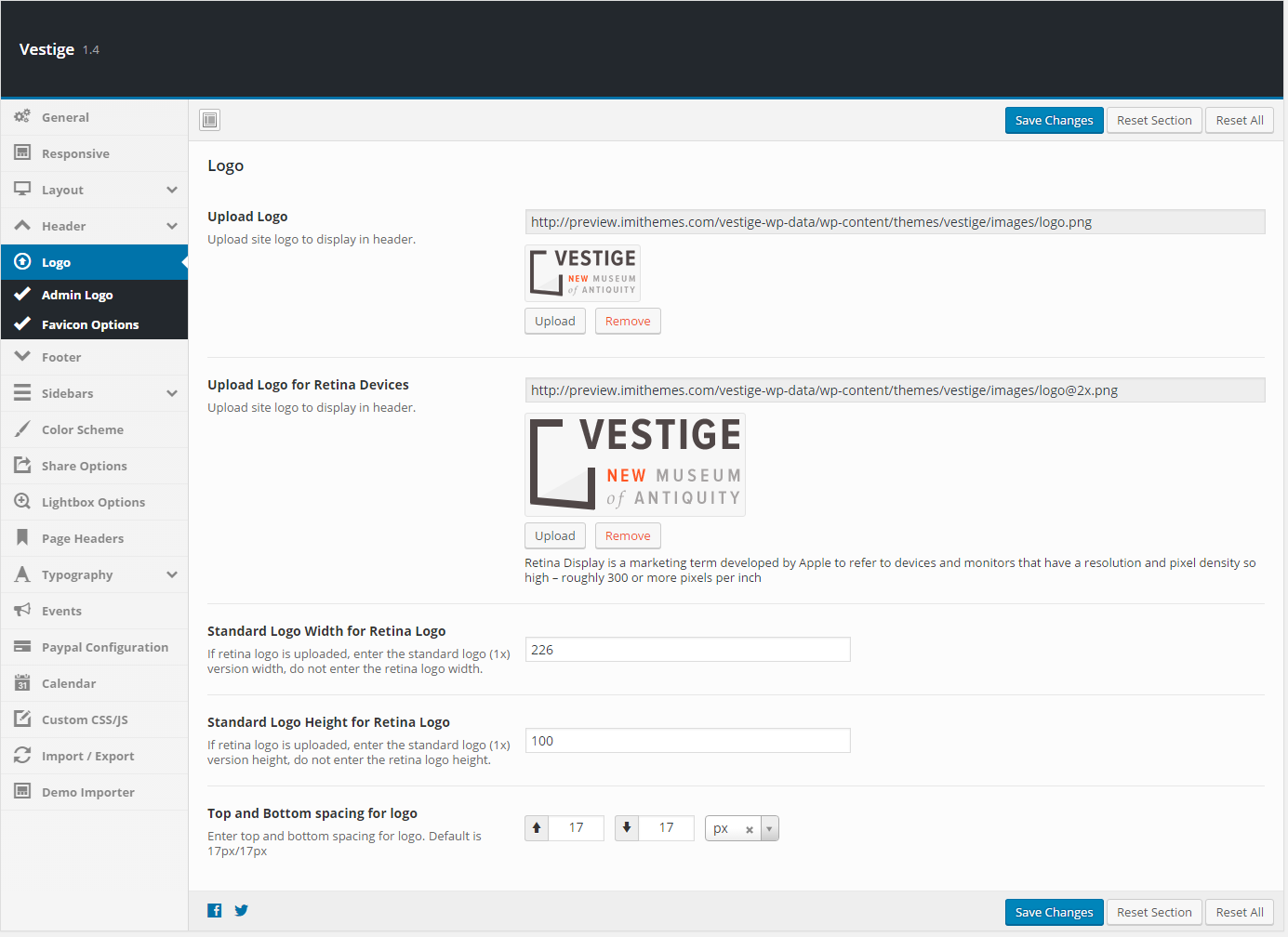
| Setting | Description |
|---|---|
| Background color for the Logo | Background color for the logo block used in Header Style 1. |
| Upload Logo | Upload the main site logo displayed in the header. |
| Upload Logo for Retina Devices | Upload a 2× resolution version of the logo for high-DPI (Retina) screens. |
| Standard Logo Width for Retina Logo | Enter the standard (1×) logo width in pixels. Do not enter the retina image width. |
| Standard Logo Height for Retina Logo | Enter the standard (1×) logo height in pixels. |
| Top and Bottom spacing for logo | Top and bottom spacing around the logo area. Default: 17px / 17px. |
Logo – Admin Logo
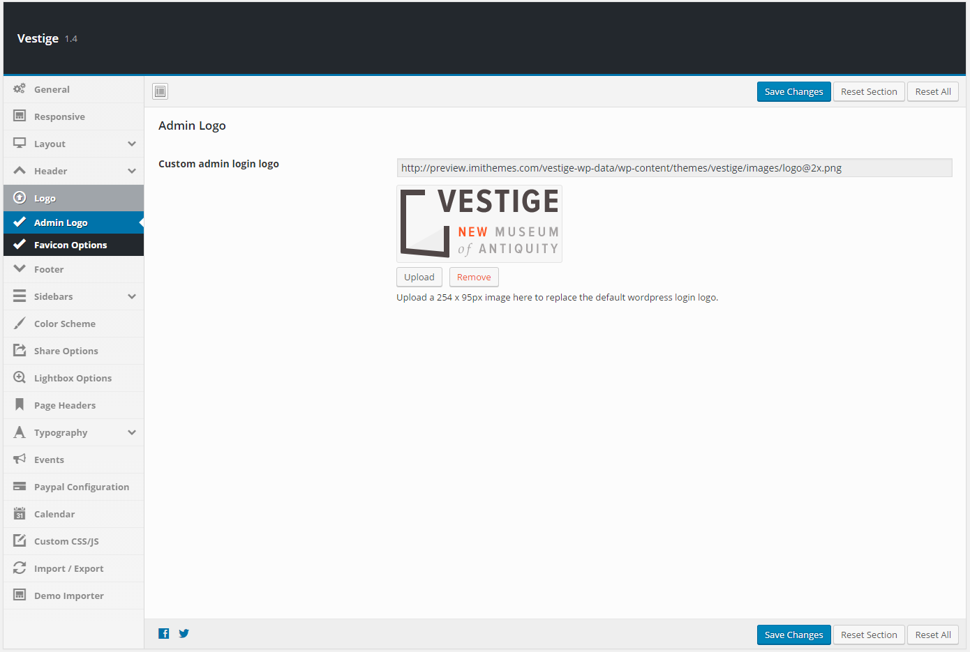
| Setting | Description |
|---|---|
| Custom admin login logo | Upload a 254×95px image to replace the default WordPress logo on the wp-login.php page. |
Logo – Favicon Options

| Setting | Description |
|---|---|
| Custom favicon | Upload a favicon image shown in browser tabs and bookmarks. |
| Apple iPhone Icon | Upload a 57×57px icon for iPhone home screen shortcuts. |
| Apple iPhone Retina Icon | Upload a 114×114px icon for iPhone Retina home screen shortcuts. |
| Apple iPad Icon | Upload a 72×72px icon for iPad home screen shortcuts. |
| Apple iPad Retina Icon | Upload a 144×144px icon for iPad Retina home screen shortcuts. |
Footer

| Setting | Description |
|---|---|
| 100% Footer Width | Set the footer to span 100% of the browser width. Only available in Wide layout mode. |
| Footer Layout | Number of widget columns in the footer widget area: 1, 2, 3, 4 (default), or 5. |
| Footer widget area background | Background color for the footer widget area. Default: #F9F8F5. |
| Footer widgets area Top/Bottom padding | Top and bottom padding for the footer widget area (no “px”). |
| Footer widgets area border top | Border line above the footer widget area. Default: 1px solid #eeeeee. |
| Footer widgets title typography | Font, size, weight, and color for footer widget titles. |
| Footer widgets area text typography | Font settings for footer widget body text. |
| Footer widgets area links color | Color for links inside footer widgets. Default: #cccccc. |
| Enable Footer copyrights area | Show or hide the copyright bar below the footer widget area. Default: Enabled. |
| Footer Copyright Text | Text shown in the copyright bar. Supports HTML. |
| Footer copyrights area background | Background color for the copyright bar. Default: #ffffff. |
| Footer copyrights area Top/Bottom padding | Padding for the copyright bar (no “px”). |
| Footer copyrights area border top | Border line above the copyright bar. Default: 1px solid #eeeeee. |
| Footer copyrights area text typography | Font settings for the copyright bar text. |
| Footer copyrights area links color | Link color in the copyright bar. Default: #cccccc. |
| Social Links | Social profile URLs displayed as icons in the footer. Drag to reorder. |
| Social icons size and color | Size and foreground color for the footer social icons. |
| Link / Hover / Active Color | Color states for footer social icon links. |
| Background color for social icons | Background fill for footer social icon buttons. |
| Width/Height for social icons | Dimensions of the footer social icon buttons. |
Sidebars

| Setting | Description |
|---|---|
| Sidebar position | Global sidebar position: Left, Right, or None. Can be overridden per individual page or post. |
| Single Post | Default sidebar for single blog post pages. |
| Page | Default sidebar for all standard pages. |
| Single Event | Default sidebar for single event pages. |
| Single Exhibition | Default sidebar for single exhibition pages. |
| Single Team Member | Default sidebar for single team member pages. |
| Single Artwork | Default sidebar for single artwork pages. |
| Single Venue | Default sidebar for single venue pages. |
| Single Artist | Default sidebar for single artist pages. |
| Event Archive Sidebar | Sidebar shown on event archive and category/tag pages. |
| Exhibition Archive Sidebar | Sidebar shown on exhibition archive pages. |
| Artwork Archive Sidebar | Sidebar shown on artwork archive pages. |
| Shop Archive Sidebar | Sidebar shown on WooCommerce shop archive pages. |
| Search Page Sidebar | Sidebar shown on the search results page. |
Sidebar Widgets

| Setting | Description |
|---|---|
| Background color for sidebar widgets | Background color for sidebar widget boxes. |
| Sidebar widgets border color | Border around each sidebar widget box. Default: 5px solid #F9F8F5. |
| Typography for sidebar widgets | Font settings for sidebar widget body text. |
| Link colors set for sidebar widgets | Color, hover, and active states for links inside sidebar widgets. |
| Sidebar widgets title typography | Font, size, and weight for sidebar widget titles. |
| Sidebar widget title border bottom | Border line below sidebar widget titles. |
| Sidebar widget title half border bottom color | Highlight/accent color for the decorative half-border beneath widget titles. |
Color Scheme

| Setting | Description |
|---|---|
| Color scheme | Choose between Pre-Defined (select from presets) or Custom Color (enter your own). Default: Pre-Defined. |
| Predefined Color Schemes | When Pre-Defined is selected: pick from the available preset colour schemes, each applying a coordinated palette across links, buttons, and accents. |
| Custom Theme Color | When Custom Color is selected: pick a primary accent colour using the colour picker. Applied to buttons, links, and key UI elements. |
Share Options

| Setting | Description |
|---|---|
| Social Sharing | Master switch to enable or disable all social sharing buttons site-wide. Default: Enabled. |
| Share Buttons Style | Icon shape: Rounded or Squared. |
| Share Buttons Color | Colour scheme for share icons: Brand Colors, Theme Color, or Greyscale. |
| Social share options | Toggle individual share networks on or off (Facebook, Twitter, Google+, Tumblr, Pinterest, Reddit, LinkedIn, Email, VK). |
| Select share buttons for post types | Choose which post types (Posts, Events, etc.) display social sharing buttons. |
| Tooltip text (per network) | Custom browser tooltip text for each share icon. Defaults: “Share on Facebook”, “Tweet”, etc. |
| Show share text and icon | Show or hide the “Share” label text alongside the icons. |
| Share icons box size | Width and height of each share icon button. |
| Share icons font size | Font/icon size inside each share button. |
Lightbox Options
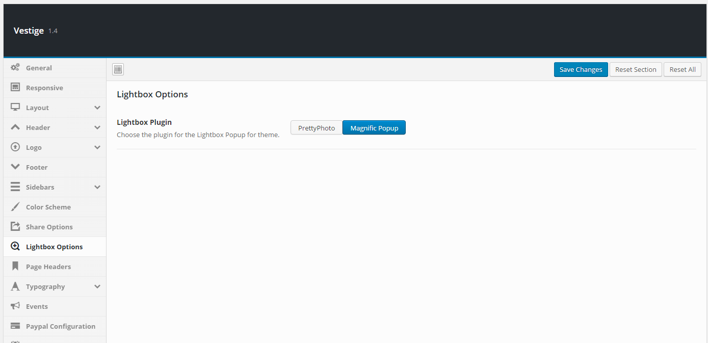
| Setting | Description |
|---|---|
| Lightbox Plugin | Choose the lightbox engine: PrettyPhoto or Magnific Popup. Default: PrettyPhoto. |
| Theme Style | Visual style for the PrettyPhoto overlay: Default (pp_default), Light Rounded, Dark Rounded, Light Square, Dark Square, or Facebook. |
| Overlay Opacity | Opacity of the dark overlay behind the lightbox. Range: 0.1–1.0. Default: 0.5. |
| Show Image Title | Show or hide the image title/caption inside the lightbox popup. |
Page Headers
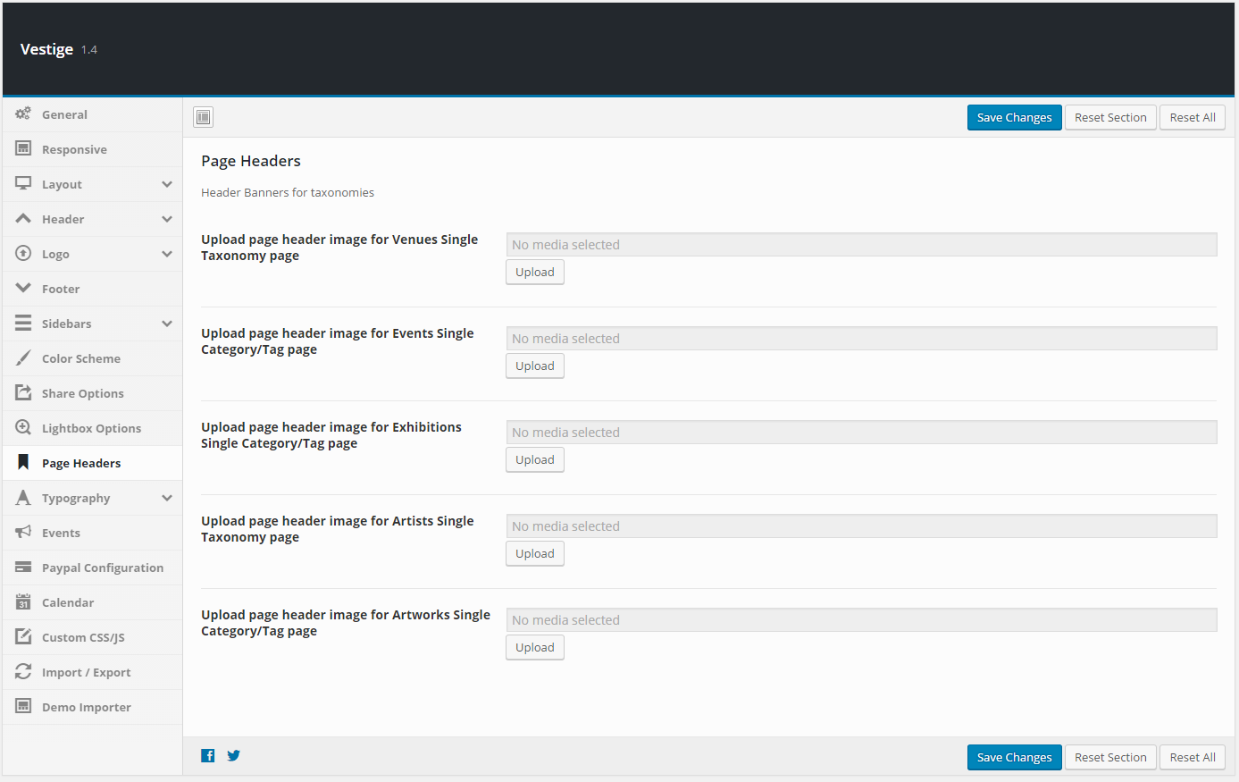
| Setting | Description |
|---|---|
| Upload page header image for Venues | Default banner image for venue single/taxonomy pages. |
| Upload page header image for Events | Default banner image for event category/tag archive pages. |
| Upload page header image for Exhibitions | Default banner image for exhibition category/tag archive pages. |
| Upload page header image for Artists | Default banner image for artist taxonomy pages. |
| Upload page header image for Artworks | Default banner image for artwork category/tag archive pages. |
| Title for Events Archive | Custom page heading for the Events archive page. |
| Title for Blog Archive | Custom page heading for the Blog archive page. |
| Title for Exhibitions Archive | Custom page heading for the Exhibitions archive page. |
| Title for Team Archive | Custom page heading for the Team archive page. |
| Title for Shop Archive | Custom page heading for the WooCommerce shop archive. |
| Title for Artworks Archive | Custom page heading for the Artworks archive page. |
Typography
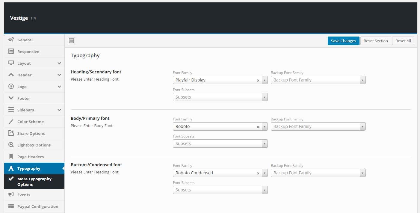
| Setting | Description |
|---|---|
| Heading/Secondary font | Google Font used for all headings. Applied globally to H1–H6 unless overridden in More Typography Options. |
| Body/Primary font | Google Font used for body text, paragraphs, and general content. |
| Buttons/Condensed font | Google Font used for buttons, labels, and condensed UI text elements. |
More Typography Options
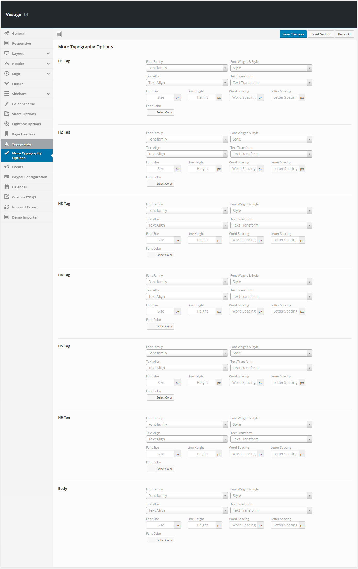
| Setting | Description |
|---|---|
| H1 Tag | Individual font, size, weight, line-height, and color override for all H1 headings. |
| H2 Tag | Individual typography override for all H2 headings. |
| H3 Tag | Individual typography override for all H3 headings. |
| H4 Tag | Individual typography override for all H4 headings. |
| H5 Tag | Individual typography override for all H5 headings. |
| H6 Tag | Individual typography override for all H6 headings. |
| Body | Override the default body text typography independently of the primary font selector. |
Events
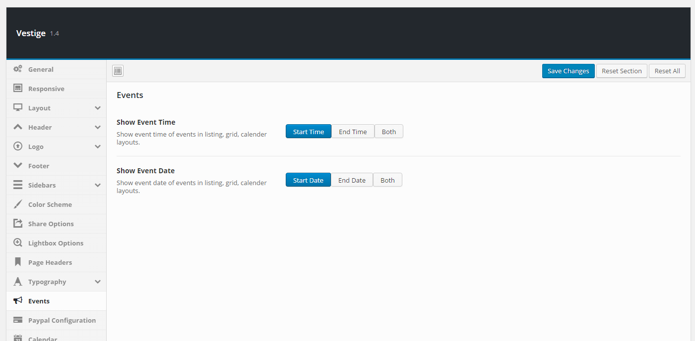
| Setting | Description |
|---|---|
| Enable Event | Enable or disable event-specific stylesheets and scripts. Disable if using a separate events plugin that loads its own assets. Default: Enabled. |
| Show Event Time | Display the event time in listing, grid, and calendar views. Default: Enabled. |
| Show Event Date | Display the event date in listing, grid, and calendar views. Default: Enabled. |
| Show Event Until | Show the time until the event starts or ends in event listings. |
| Exhibitions View | Choose how exhibitions are displayed: Multiple View (one entry per day for the active period) or Single View (one entry per exhibition with start/end dates). Default: Multiple View. |
Paypal Configuration

| Setting | Description |
|---|---|
| Paypal Email Address | Your PayPal Business account email address. Ticket/event payments are sent here. |
| Paypal Token | Your PayPal identity token for IPN (Instant Payment Notification) verification. Obtain from PayPal account settings. |
| Paypal Site | Choose Sandbox (test mode) or Live (production). Default: Live. |
| Payment Currency | Currency for all payments (USD, EUR, GBP, AUD, and many more). Default: USD. |
| Use currency symbol | Display the currency symbol (e.g. $) instead of the short code (e.g. USD). Default: Yes. |
Calendar
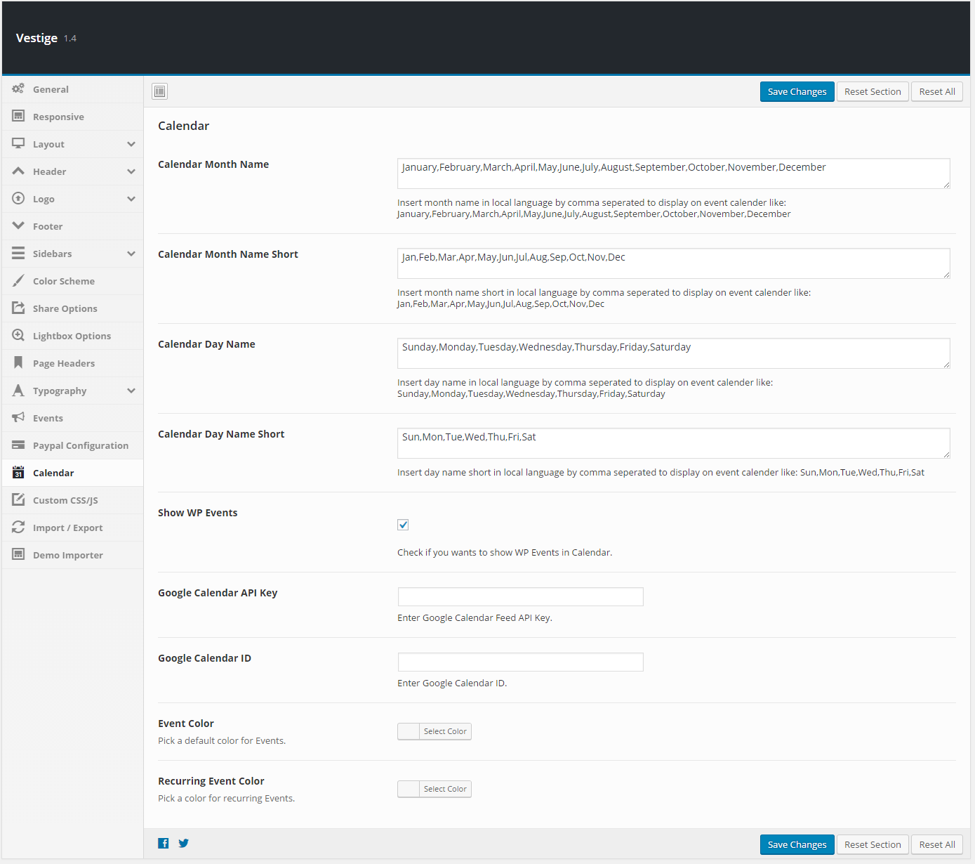
| Setting | Description |
|---|---|
| Calendar Month Name | Comma-separated full month names in your local language for the event calendar (e.g. January,February,…,December). |
| Calendar Month Name Short | Comma-separated abbreviated month names (e.g. Jan,Feb,…,Dec). |
| Calendar Day Name | Comma-separated full day names starting from Sunday (e.g. Sunday,Monday,…,Saturday). |
| Calendar Day Name Short | Comma-separated abbreviated day names (e.g. Sun,Mon,…,Sat). |
| Show WP Events | Include standard WordPress Events in the calendar view. |
| Google Calendar API Key | API key for connecting to a Google Calendar feed. |
| Google Calendar ID | The calendar ID of the Google Calendar to display in the event calendar. |
| Event Color | Default colour for event markers in the calendar. Individual events can override this. |
| Recurring Event Color | Colour used for recurring event markers in the calendar. |
Custom CSS/JS

| Setting | Description |
|---|---|
| CSS Code | Enter custom CSS rules using the built-in Ace editor (Monokai theme). Output site-wide, overriding default theme styles. |
| JS Code | Enter custom JavaScript using the built-in Ace editor (Chrome theme). Output at the bottom of every page. |
Import/Export
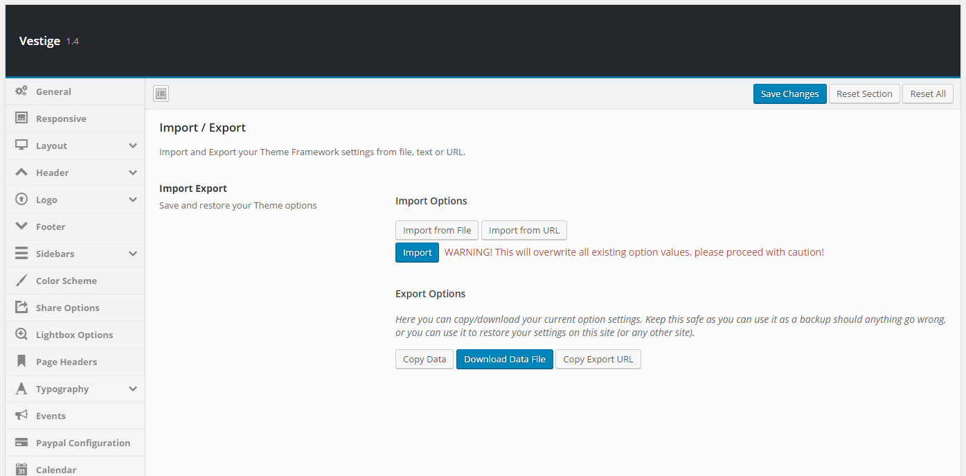
| Setting | Description |
|---|---|
| Export | Click Export to copy all current Theme Options as a portable data string. Use this to back up settings or replicate them on another Vestige installation. |
| Import | Paste previously exported data and click Import to restore all Theme Options. This overwrites the current configuration. |
| Reset to Defaults | Reset all Theme Options to factory defaults. Always export a backup before using this. |
Demo Importer

The Demo Importer is a one-click tool to import the pre-built Vestige Museum demo content, including pages, sliders, menus, widgets, and sample posts. Navigate to Appearance → Demo Importer, choose a demo, and click Import. This is best used on a fresh WordPress installation — importing over existing content may cause duplicates.
ℹ️ Always back up your database before running a demo import.